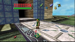
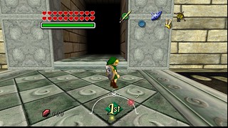
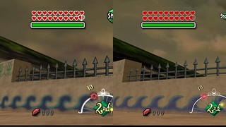
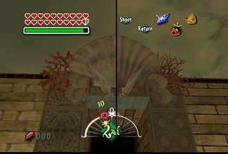
What's new
  • Most issues reported these days stem from users not enabling their emulators to use the required amount of RAM.
    We also tend not to use the search feature but post our issues within the texture pack release page.
    Failure to load a texture pack should not be posted in the release thread unless you have already patched the emulator.

    If you don't have the resources to use Large/HD texture packs please do not attempt to do so.
    Users should have a minimum amount of System RAM not less then 4GB's.
    If you have less then 4GB's of RAM do not post about how your emulator crashes,
    RAM is dirt cheap so invest some money into your PC.

    I would like to say thanks to squall_leonhart
    for posting this Solution.
  • As members seem to have a problem reading the release threads:

    Djipi's packs are built for the (Glide64 finale) Plugin. Nolonger supported!
    Djipi's packs are built for the (GlideN64) Plugin.
    These two Plugins are two completely different pieces of code.

    GlideN64.HTC archived packs locked by Djipi are not compatible with use on Glide64, Rice video, nor Jabo video.

    Glide64.DAT archived packs locked by Djipi are not compatible with use on GlideN64, Rice video, nor Jabo video.

    Djipi has never made a pack for use with Rice video and never will. any packs found in this format are not authorized!

    GlideN64 is the new standard and only requires an Radeon 6XXX.
    This is a somewhat older GPU and should be readily available.
    Do everyone a favor and upgrade!

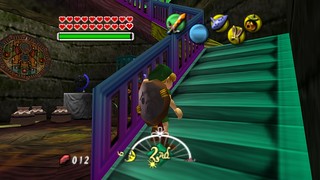
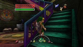
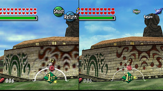
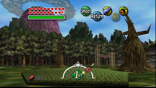
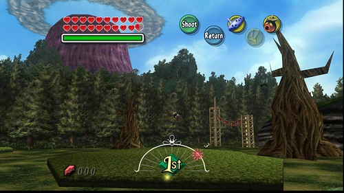
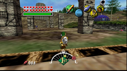
Majora's Mask N64HD Project Completed!

OP
N

Nerrel

Member
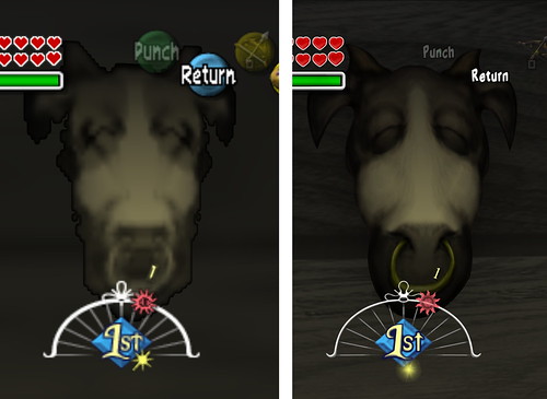
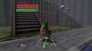
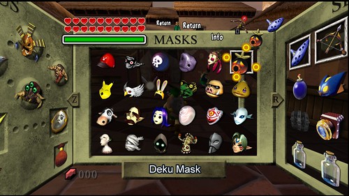
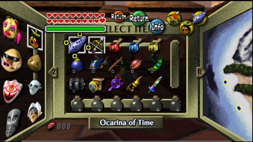
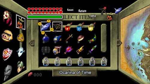
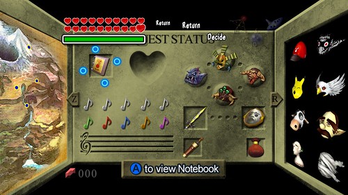
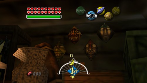
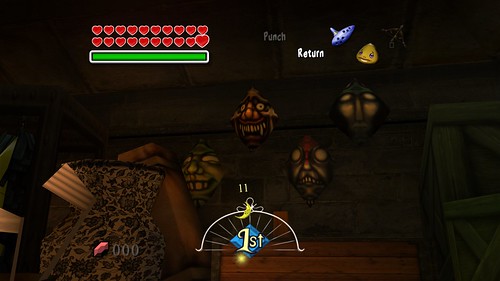
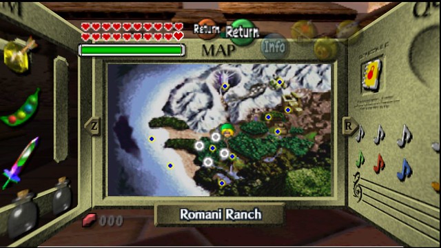
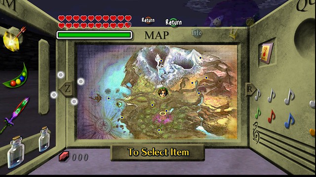
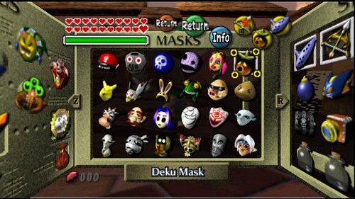
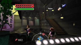
I'm going to have to split this last clock town update in two posts. Here are the pause menus:


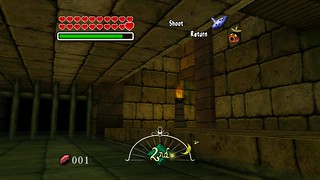
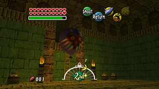
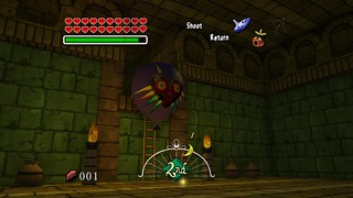
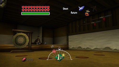
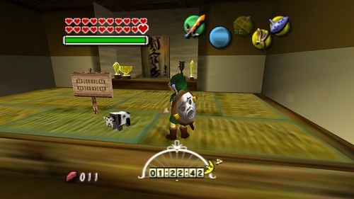
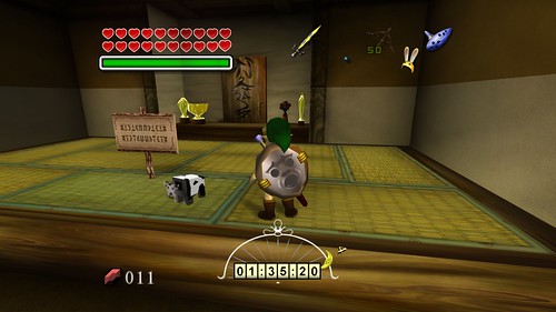
The dojo:


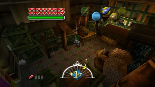
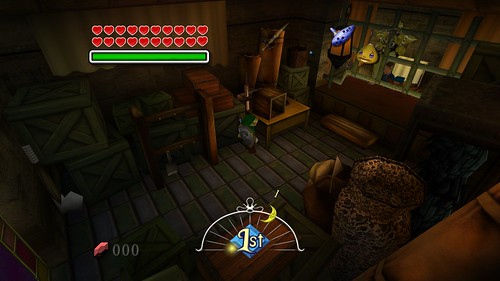
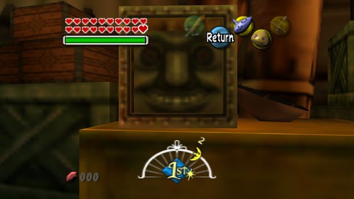
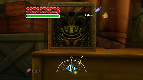
And the curiosity shop, which I felt like I was stuck in forever. I liked the change MM3D made by putting the face from beneath the well in OoT in the glass box, so I did the same and drew it in:


Last edited:
OP
N

Nerrel

Member
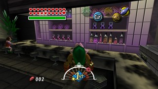
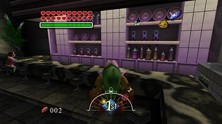
The last few months were much busier than I expected, but Clock Town is finally done. I also tried to work on the sky, but it's sort of a nightmare with 93 textures that have to be assembled like a jigsaw puzzle before work can begin on it. If anyone knows the creators of the other packs, I'd love to ask if there's a trick to sorting it out or if it just has to be slogged through. Anyway, here are the last shops...


Milk bar:


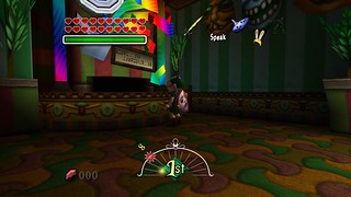
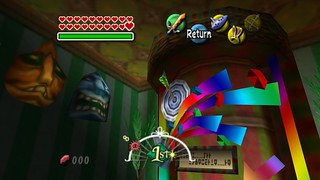
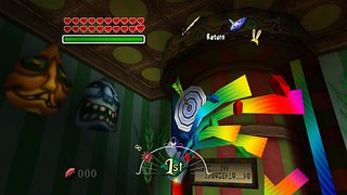
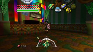
Lotto shop (I'm pleased with how the rainbow animation looks in motion):


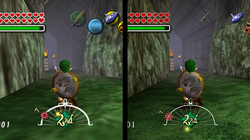
Deku grotto:


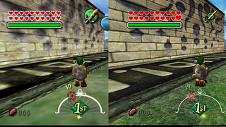
This wall texture is huge and hard to see all at once in screenshots:
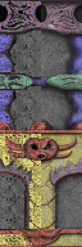


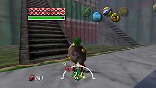
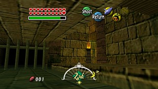
Sewer:


(The astral observatory is being worked on now, so I'm cheating and considering it separate from Clock Town.)


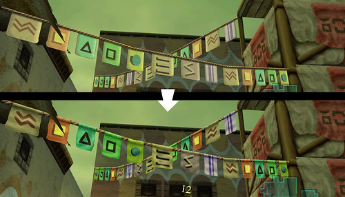
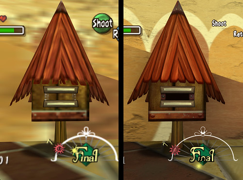
I also revisited some earlier textures and improved them. The prayer flags were one of the first textures I did and I thought I could do better, and I noticed recently for the first time that the metal bars on the mailbox actually pop open wider after interacting with it, meaning there should be an opening for mail in between them. In addition to those kinds of changes, I also did a lot of textures outside of clock town in each of the four main directions. Some places, like Sakon's hideout and Lon Lon Ranch, are actually very far along.


I also tried to get ambient occlusion to remain compatible with the new GlideN64 releases, but it turned out to be a dead end. Gonetz helped a lot and was willing to create an option to make the depth buffer available, but unfortunately ReShade won't use the depth buffer even if it were available; it uses the FBO instead, since it just auto detects where the most draw calls are coming from. Technically, MXAO can still be used in the new versions, but it won't align with the environment correctly. That's a shame, since the new GlideN64 versions can actually run it with the framebuffer emulation on. For now, the only way to get MXAO would be to use the 2.0 release and give up on the great new lighting overhaul the game got.

The new GlideN64 versions also handle HD textures a lot differently, so I had to alter a lot of textures to remain compatible with it. 2.0 allowed textures with different proportions from the original to work and scale to the correct proportion in-game, but now textures have to be the exact proportion as the original. I think I've found and corrected all the textures that needed to be addressed.


From here it should be much easier, since the game constantly reuses textures with slight alterations for different areas. I also don't expect any other area to be as dense as Clock Town was. If anyone wants to try the textures out firsthand, here's a link to an up-to-date version of the pack (I also updated the link in the OP):
https://mega.nz/#!nYElTDQI!rPcg_2HiaOUe5A64n_RM8bfloCdLN2knCufP-yrVXwE

As always, I'd love to hear more feedback, and thanks to everyone who has been supportive so far.
 

death--droid

Active member
Moderator
Keep up your fantastic work Nerrel, you have done a superb job so far at managing to recreate the look of the original textures and not killing the charm of the originals.
 
OP
N

Nerrel

Member
Thanks, that's exactly what I hope to hear.

I forgot to mention that I did try the Collector's Edition in Dolphin. It didn't seem like SSAO worked through Ishikura, and the game is noticeably buggier by nature. Barring some huge upgrade, like a fully working 30/60fps mod, I think I'll stick with GlideN64. It's harder to work with but it's more stable and accurate, especially now that the point lighting has been decoded.

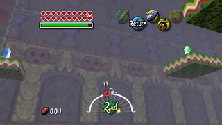
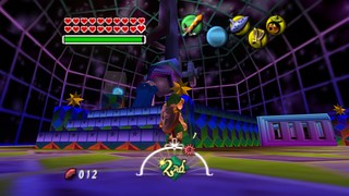
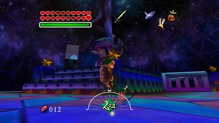
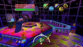
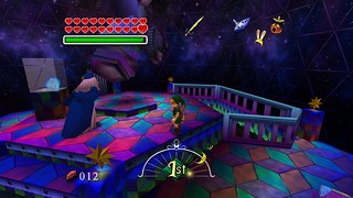
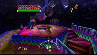
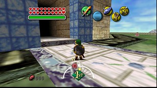
The astral observatory is done. I'm really proud of how it turned out and how much the sense of space has changed. This is one example of an area that was clearly limited by the N64 tech, so I didn't mind changing the look:


Nerd

New member
I've been keeping up with your project since the start and I'd like you to know I think this is the best texture pack I've ever seen for a game. I hope it's finished one day. Although I did want to say that the brick walls and the floor in the observatory could take a bit more from the original. Just looking at thumbnails the wall has a bit more grit to it and I kind of like the over saturated floor on the top. Great work though, seriously.
 
OP
N

Nerrel

Member
I've been keeping up with your project since the start and I'd like you to know I think this is the best texture pack I've ever seen for a game. I hope it's finished one day. Although I did want to say that the brick walls and the floor in the observatory could take a bit more from the original. Just looking at thumbnails the wall has a bit more grit to it and I kind of like the over saturated floor on the top. Great work though, seriously.

Thank you, but this pales in comparison to the Resident Evil 4 HD pack. I wish I could do the kind of model edits and texture remapping that they do.

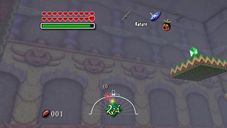
I recolored the tiles to match the original and this is what it looks like:


There's a very different mood with each; the original coloring draws attention to itself with complementary colors, clashing with the star field and making the platform much more prominent. It makes the space seem smaller and warmer. The new coloring blends in/recedes and puts the focus on the stars; it looks more like starlight is illuminating it and I think the space seems bigger and "colder" that way. I like them both and could go with either.
 
Last edited:

microdev

Member
I also tried to work on the sky, but it's sort of a nightmare with 93 textures that have to be assembled like a jigsaw puzzle before work can begin on it. If anyone knows the creators of the other packs, I'd love to ask if there's a trick to sorting it out or if it just has to be slogged through.

There is a tool called HighResEaser that does the skybox assembling and slicing job for you.

Please find the instructions for skybox creation here
The latest version of HighResEaser can be found here

Your texture are really stunning btw - really great job!
 

NES_player4LIFE

Texture Pack Invader
Moderator
There is a tool called HighResEaser that does the skybox assembling and slicing job for you.

Please find the instructions for skybox creation here
The latest version of HighResEaser can be found here

Your texture are really stunning btw - really great job!

Whoever wrote that script was a genius.
 
OP
N

Nerrel

Member
There is a tool called HighResEaser that does the skybox assembling and slicing job for you.

Please find the instructions for skybox creation here
The latest version of HighResEaser can be found here

Your texture are really stunning btw - really great job!

Thanks for that. I got some help on the Dolphin forums a while ago and used a watermarking program to paste the filenames into each texture, then I looked at the sky in-game to see how they fit together. Your solution seems better, but either way I've got both the day and night skyboxes assembled and ready to go now.
 

frostlink

New member
First of all, I just wanted to say that Majora's Mask is my favorite game of all time and one of the earliest games i played. I've completed about 20+ playthroughs of it including getting the fierce deity mask; i'm quite attached to it. The work you are doing on this project is unbelievable, the textures are incredibly high quality and faithful to the original game! I'm very excited to see where this project goes from here on out, thanks for the good work you've been doing for this game.
 

Zanak

New member
Nerrel

I think you should stick with the darker version of the floor tiles. Ordinarily I would say stick to the original, but this is a rare exception and the dark version looks way better.
 
OP
N

Nerrel

Member
I've got the daytime sky done. I was lucky enough to get a lot of help from other people who already worked on these textures and figured out their baffling arrangements in past mods. The nighttime sky will be much simpler once I get the time to work on it:


Text isn't the most exciting thing in the world, but I did manage to improve the fonts in the game. I had originally used Arial since it was the closest match I had, but I managed to find the original font both MM and OoT used; it's called chiaro B, a Japanese font that's very hard to track down. I finally managed to find it and updated the fonts, so now the in-game text is 100% accurate to the original (and just looks cooler than Arial):

Original text:

Chiaro B:

Arial:


28178502779_973aca5184_b.jpg

39247884004_e3aabbc627_o.jpg


I also got a hold of the font used for the boss names:
39247837904_7c26f1e1ef_o.png

26085422358_25c575fdb3_o.png


First of all, I just wanted to say that Majora's Mask is my favorite game of all time and one of the earliest games i played. I've completed about 20+ playthroughs of it including getting the fierce deity mask; i'm quite attached to it. The work you are doing on this project is unbelievable, the textures are incredibly high quality and faithful to the original game! I'm very excited to see where this project goes from here on out, thanks for the good work you've been doing for this game.

Glad to hear it!

Nerrel

I think you should stick with the darker version of the floor tiles. Ordinarily I would say stick to the original, but this is a rare exception and the dark version looks way better.

Thanks, it helps to have this kind of push when I'm indecisive.
 
OP
N

Nerrel

Member
Here's Termina field part one:


The remaining field textures have had some failed first drafts done... there are a lot of tricky mappings to deal with, which I'll be prepared for on the second pass.
 
OP
N

Nerrel

Member
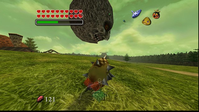
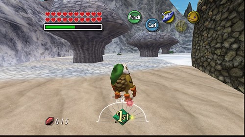
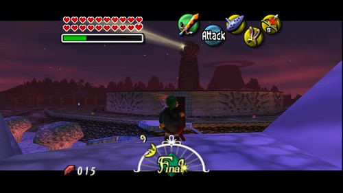
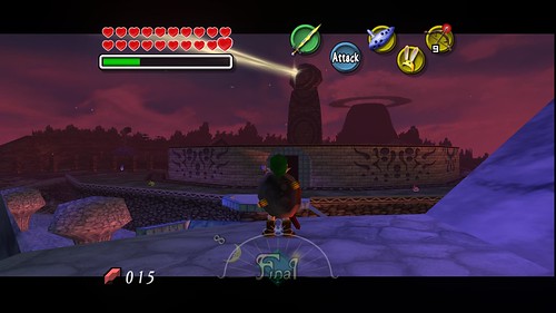
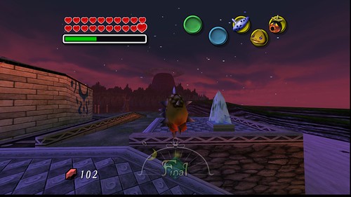
The rest of Termina and the night sky:


Damn ReShade UI!


Unfortunately, there's nothing I can do about the square stars... They're not generated with textures. Hopefully it would be possible to improve them with a rom hack, or maybe even a gameshark code? I know some visual elements can be changed through GS cheats. The only solution I've found for now is to use a bokeh depth of field effect to subtly distort them, but the drawback is that the UI will also be slightly blurred.

You might have noticed that I'm trying new full size buttons for the HUD. I still think they block a little too much and I may shrink them down, but I'll make sure they're big enough not to be totally lost under the items. I also recolored the world map to get rid of the blank paper at the edges, since I didn't think it matched the UI very well and it's closer to the original like this.
37608129751_693a20b027_z.jpg
26498990978_b17ee857c9_z.jpg

(You can see a bit of the first version here)

There are about 200 new textures since my last upload and a few hundred old ones were revised (including the entire text system), so I updated the pack. Admentus hasn't had anything to work with for a long while!
https://mega.nz/#!TAlxUbhK!MK6mu2eJsSEBxLHqkxO-Wlrh3crNQYqR5ZCE-X3Fpn8
 

AlighieriWolf

New member
It doesn't mater if you can't change the stars in he sky. The texture pack looks very beautiful, keep it up, you let me speechless! c:
 

Top